We have been using operating systems for years and years, but most of us never know the meaning behind those operating system logos. In this post we covered 10 operating system in current market and their logo meaning.
1. Windows 7:
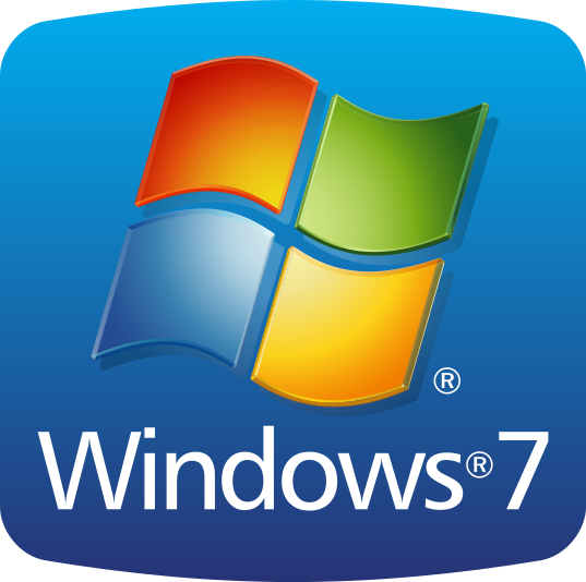
Windows 7 is the 7th in the family of windows as the name suggests. The windows 7 logo indicates that the system has been tested for several products and that the products will work smoothly with windows 7 installed. The four colors in the logo indicate
- RED for Microsof Office.
- BLUE for Windows live server, Internet Explorer etc.
- GREEN for Xbox and Xbox live.
- Yellow for Bing.
2. Windows 8:
![]() This logo of Windows 8 is a mixture of modern and classical style. It does not indicate any material thing like Wood, glass etc and is said to be ‘Authentically Digital.’ Though the logo seems to be simple yet confident to allow you to carry your daily work smoothly, fastly and more reliably.
This logo of Windows 8 is a mixture of modern and classical style. It does not indicate any material thing like Wood, glass etc and is said to be ‘Authentically Digital.’ Though the logo seems to be simple yet confident to allow you to carry your daily work smoothly, fastly and more reliably.
3. Windows XP: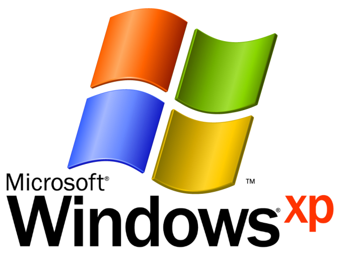
The name XP says it all as its full name seems to eXPerience and is a long operating system to help its users in home, Office and personal computer. The logo is a simple geometrical shape of a window which leads from originality to digitalism.
4. Ubuntu:![]() The meaning of ‘Ubuntu’ is ‘We all are one’ and if we look closely in the logo we can see people joining their hands to hands and this is a sign of unity. So this Operating system is a symbol of love and harmony among all the people around the globe.
The meaning of ‘Ubuntu’ is ‘We all are one’ and if we look closely in the logo we can see people joining their hands to hands and this is a sign of unity. So this Operating system is a symbol of love and harmony among all the people around the globe.
5. Linux mint:
From the logo we can easily see in the mint a fist forming a design of the alphabets ‘L’ and ‘m’. So, this operating system gives us the freedom to do anything and that the whole world is in our hands because it is an Easy to use and an up to date operating system.
6. Fedora:![]() Just from the logo we can think of what type of Operating system Fedora is. The logo indicates that we get infinite freedom of spreading our thoughts to all parts of the world in the second most popular Linux based OS behind Uuntu.
Just from the logo we can think of what type of Operating system Fedora is. The logo indicates that we get infinite freedom of spreading our thoughts to all parts of the world in the second most popular Linux based OS behind Uuntu.
7. Mac OS X Loopard
This Operating system is the 6th major release of the Mac OS X. Though the logo is simple and the classical way of expressing the operating system with a Capital X in the centre which indicates a overhauled quick time X with a cleaner interface and recording tools.
8. Unix
The name of the Operating system speaks for itself. ‘The logo, constituting the name of the OS, implies to ‘Universality’ and ‘Uniqueness’.
9. Debian
Stable and versatile operating system of the Linux. This swirl type of a logo shows the visual identity of this operating system. This operating system has the free soft wares at its core of a kernel from the Linux project.
10. Haiku
Looking at the logo we get the view that this Operating system is natural, simple and free of complexities to provide a good environment for the beginners to use. It is free of the useless links and useless difficulties and any beginner will find it much easy to navigate.